Does The Art Style Change In The Ramparts of Ice Season 2? Visual Analysis And Fan Reception
The Ramparts of Ice Season 2 is almost here, and naturally, anime fans are looking at more than just the story. Whenever a second season arrives after a successful first run, one question always comes up: does the art style still look the same?
For The Ramparts of Ice, also known as Koori no Jouheki, that question is especially interesting. The first season built much of its identity around quiet character acting, restrained expressions, soft backgrounds, and a visual atmosphere that could make an ordinary school hallway feel emotionally heavy. It was never an anime that needed constant visual spectacle to keep attention. Small changes in a character’s face often mattered more than an elaborate action sequence.
With Season 2 scheduled to premiere on October 1, 2026, fans have been closely examining trailers, promotional artwork, and early footage for signs of a major redesign. From what has been shown so far, the answer is fairly straightforward: the core art style has not been replaced. However, there are some noticeable differences in the way the anime uses color, lighting, framing, and atmosphere.
And honestly, I think that is the better approach. A dramatic redesign would have been distracting for a series whose visual language is so closely connected to its characters’ emotional state.
The Ramparts of Ice Season 2 Keeps Its Visual Foundation
The easiest way to spot a major anime art-style change is to look at the production team. A completely different studio, character designer, or director can lead to significant changes in proportions, facial features, animation timing, background work, and overall presentation.
That does not appear to be happening here.
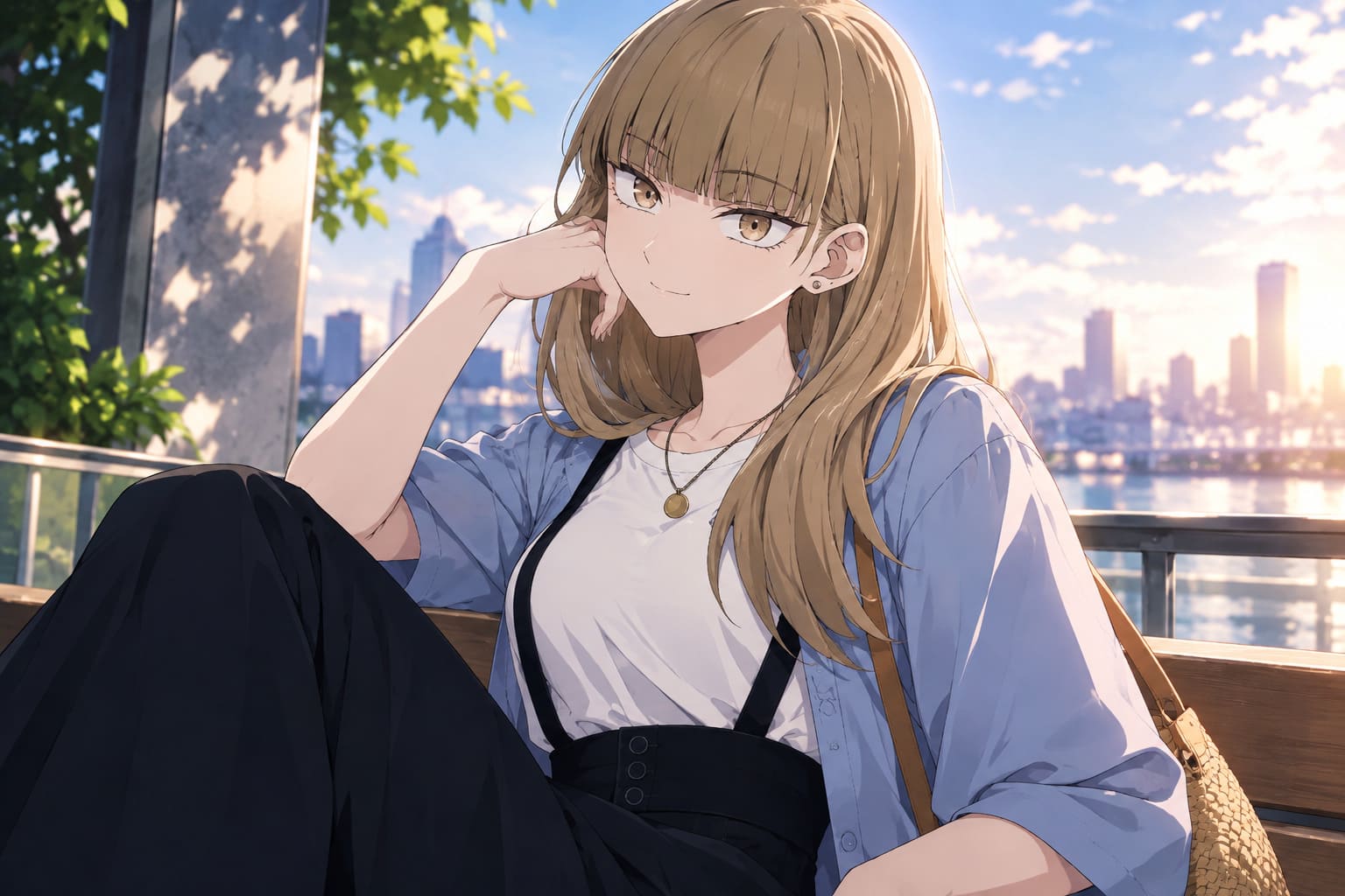
Studio KAI remains responsible for the anime, while key members of the creative team continue into the second season. Director Mankyu returns, as does series composer Yasuhiro Nakanishi. Most importantly from a character-design perspective, Miki Ogino remains involved as character designer.
That continuity matters more than some viewers might realize. Character designers establish the visual rules that determine how characters translate from the original manga into animation. Things such as face shape, eye placement, hairstyle proportions, body structure, and even the way characters react to subtle emotions can become part of the show’s visual signature.
So when you look at Koyuki, Minato, Yota, and Miki in the Season 2 material, they still feel like the same characters. There is no obvious attempt to redraw them into a completely different anime.
| Visual Element | Season 1 | Season 2 |
|---|---|---|
| Character Designs | Soft, restrained and faithful to the manga | Generally unchanged |
| Line Work | Clean and relatively delicate | Maintains the same foundation |
| Color Direction | Cooler and more subdued | Somewhat warmer in promotional material |
| Lighting | Frequently muted and atmospheric | Softer and more cinematic in key scenes |
| Facial Acting | Subtle and restrained | Continues to emphasize small expressions |
It Looks Different in Places — But That Does Not Mean the Art Style Changed
This is where the discussion gets a little more interesting.
Some viewers have looked at the Season 2 promotional material and immediately noticed that it feels warmer. That observation is fair. But I would separate art style from visual direction.
The character designs remain familiar, but the way those designs are presented appears to be evolving.
The first season frequently used cool colors, subdued backgrounds, empty space, and framing that emphasized Koyuki’s emotional isolation. It made sense for the story. The characters were often physically close while still feeling emotionally separated, and the direction had a nice habit of allowing that awkward silence to sit for a moment instead of rushing through it.
Season 2 appears more willing to introduce warmer lighting and softer color gradients. Golden tones show up more prominently in promotional scenes, while backgrounds can feel slightly more inviting.
That is a subtle distinction, but it can have a surprisingly strong effect.
When characters become more comfortable with each other, the world around them does not necessarily need a completely new design. Sometimes all it takes is warmer lighting, closer framing, and a little less visual emptiness.
Why the Warmer Color Palette Makes Sense
The Ramparts of Ice has always used its visual presentation to support its emotional themes. The title itself is built around the idea of barriers, distance, and emotional walls. Koyuki’s reserved personality naturally lends itself to a colder visual environment.
As relationships develop, that visual metaphor can change without requiring a redesign.
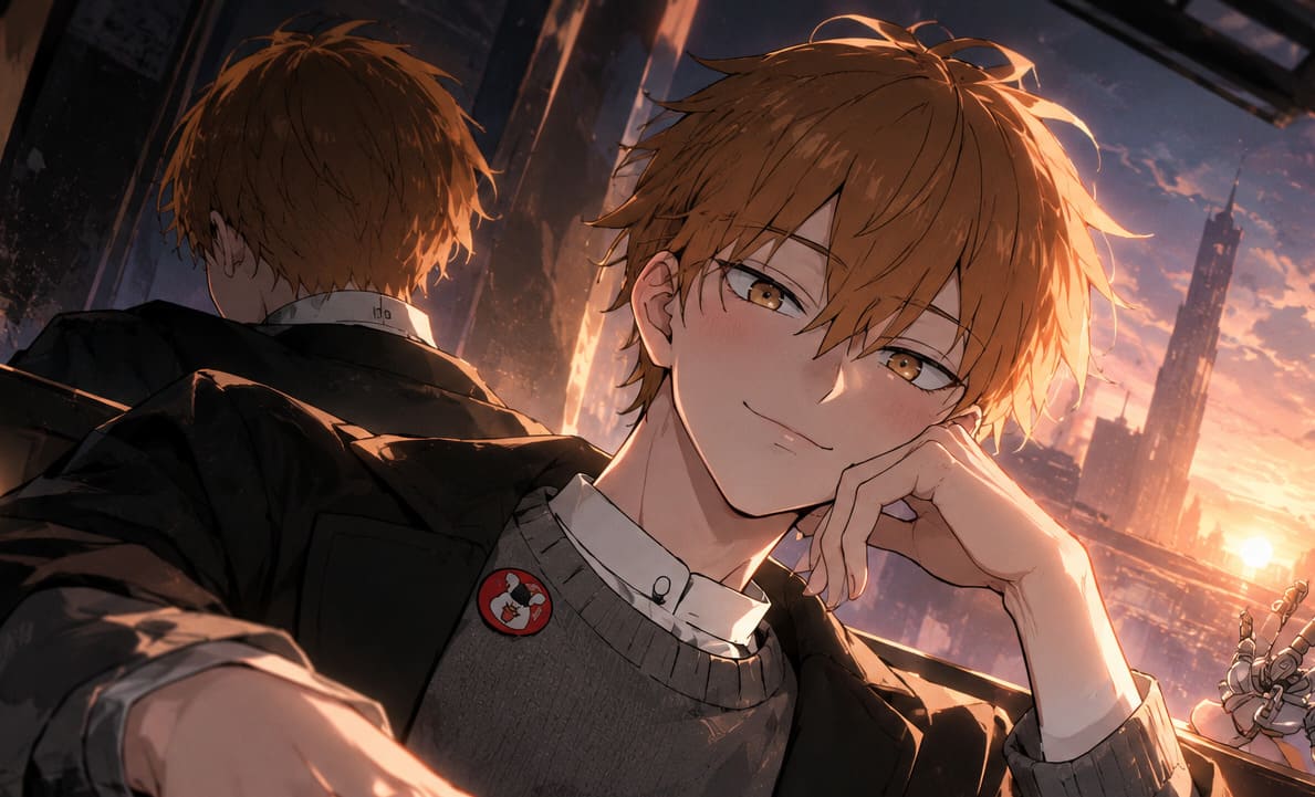
Season 2 seems to be moving toward:
- Warmer lighting during more intimate character moments.
- More depth of field to isolate characters from their surroundings.
- Softer backgrounds during emotional conversations.
- More expressive framing when relationships reach important turning points.
These changes are easy to miss if you are only checking whether the characters have different hairstyles or facial proportions. But they are exactly the kind of adjustments that can make a sequel feel visually more mature without throwing away what worked before.
Koyuki Still Looks Like Koyuki
For me, this is probably the most important part.
Koyuki’s appeal was never based purely on her character design. Her expressions were a huge part of why she worked. A tiny change in her eyes or the way she holds her face can communicate something that another series might explain through several lines of dialogue.
The Season 2 material appears to understand that.
There is no obvious attempt to make Koyuki more conventionally glamorous or dramatically redesign her for promotional purposes. Her reserved appearance remains intact, and that is important because the character’s visual restraint is part of her personality.
When an anime changes a character too aggressively between seasons, it can sometimes feel like you are watching the same name attached to a slightly different person. The Ramparts of Ice does not seem to be taking that route.
The Chibi Comedy Is Still Part of the Identity
One of the more enjoyable visual tricks in the series is its ability to switch between emotionally detailed scenes and much simpler comedic expressions.
The manga’s creator, Koucha Agasawa, has a recognizable way of pushing characters into exaggerated, almost soft and cartoon-like forms when the mood turns comedic. The contrast works because the serious scenes are otherwise relatively restrained.
Instead of making the entire show visually loud, the anime saves those exaggerated expressions for moments where they actually have an impact.
Season 2 appears to continue using that contrast. You can have a serious conversation one moment and then get a ridiculously simplified reaction immediately afterward. It sounds like a small thing, but this balance is useful for a story that spends so much time dealing with anxiety, awkwardness, romance, and emotional uncertainty.
Without those lighter moments, the series could become exhausting. With them, the characters feel more like actual teenagers rather than dramatic machines built exclusively to suffer.
What Fans Are Actually Noticing
Online discussion around the Season 2 visuals has generally focused less on a redesign and more on whether the production has maintained the atmosphere of the first season.
That distinction is important. A lot of anime fans become nervous when a sequel arrives quickly, especially when the first season developed a recognizable visual identity. There is always the fear that a faster production schedule could mean simpler animation, less detailed backgrounds, or characters drifting off-model.
The early Season 2 footage has not suggested a dramatic break from the established presentation.
Fans have particularly paid attention to Koyuki’s facial acting and the consistency of the main cast. The promotional material also suggests that the production is interested in making emotional scenes feel more intimate rather than simply adding visual spectacle.
There is also a noticeable appreciation for the fact that the anime does not appear to be borrowing the brighter, more energetic visual identity associated with You and I Are Polar Opposites. Both works come from the same creator, but they have different emotional rhythms, so keeping their visual identities separate makes sense.
So, Does The Ramparts of Ice Season 2 Have a New Art Style?
Not in the traditional sense.
The character designs, line work, proportions, and overall visual identity remain closely connected to Season 1. The returning creative staff also provides a strong degree of continuity.
What is changing is the presentation around those designs.
Season 2 appears to be experimenting more with warmer colors, softer lighting, cinematic depth of field, and closer emotional framing. Those changes can make individual scenes feel different, but they are better understood as an evolution of the visual direction rather than a complete art-style overhaul.
And personally, that is exactly what I would want from this sequel. The Ramparts of Ice does not need to reinvent its appearance. Its quiet visual language already works. The more interesting challenge is finding ways to let that language evolve as Koyuki and the rest of the cast become more emotionally open.
When Season 2 premieres on October 1, 2026, the biggest visual story may not be a new character design or a completely different animation style. It may simply be the gradual shift from cold isolation toward warmth.
The walls are still there. They just might not feel quite as cold anymore.
Key Takeaways
- The core art style remains consistent with the first season.
- Studio KAI continues to handle the anime production.
- Key staff members, including director Mankyu and character designer Miki Ogino, return.
- Season 2 promotional footage shows signs of warmer color grading and softer lighting.
- The series continues to rely on subtle facial expressions and character acting.
- The manga’s exaggerated comedic expressions remain an important part of the visual identity.
Bottom line: fans expecting a completely redesigned The Ramparts of Ice are unlikely to get one. What Season 2 appears to offer instead is something more restrained: the same recognizable characters and artistic foundation, presented with a visual language that gradually becomes warmer as the story moves forward.